Apple: ISNT Partner Portal

The partner portal platform is designed to streamline data management and collaboration between Apple and its various partners. It acts as a central hub for partners to access essential resources such as documents, licenses, processes, and software. Essentially, this platform serves as a gateway to a multitude of data points within the ISNT ecosystem.
However, our in-depth analysis, including heuristic evaluations, user interviews, and feedback review, uncovered significant usability challenges. These issues were particularly evident in how partners accessed and interacted with the data. We found that users often bypassed the platform, opting to use alternative methods instead. This was primarily because the application was perceived as too complex and user-unfriendly.
How could this be solved?
The project involves stages like discovery, define, development, deliver, and evolve.
We employs methods such as interviews, self-documentation, UX observations, brainstorming, design, usability testing, and prototyping to achieve its goals.
Insights are also derived from user feedback, observations, and interviews to make informed design decisions and improve the portal.
The reason for following this approach and phases is to increase project success by systematically addressing each phase's specific requirements. It ensures clarity of purpose, efficient resource allocation, high-quality execution, and long-term viability, this can be done using the the design thinking method.

Empathize
Interpretation of findings
Competitive analysis
The discovery phase is a research-oriented stage where teams gather insights about user needs and pain points to inform the design and development of a solution or product.
A complete audit of the current Partner Portal app was carried out.
An analysis and scoring of the audit

The heuristic evaluation of the Partner Portal identified several areas for improvement:
Clearer system status visibility: Newcomers might not understand how the site works or where to find what they need. Provide clear starting points for main tasks, improve the visibility of the homepage title in search engines, and add a search input box on the homepage.
Improved match between the system and the real world: Ensure terms and icons are clear and familiar to users. Increase flexibility and efficiency by supporting multiple methods for accomplishing tasks.
Better user control and freedom: Provide full control over the user interface, allowing users to return to previous states through browser navigation or breadcrumbs.
Effective error prevention: No error signs or messages were noticed during the evaluation.
Enhanced recognition rather than recall: The "manage access link" is not as intuitive as expected, forcing users to remember hidden options.
Improved aesthetic and minimalist design: Reduce the amount of information displayed in dialogues to improve legibility.
Better error recognition and recovery options: Include feedback mechanisms, such as "Did you know?" prompts, to help users learn how the site works. Improve the availability and interactivity of the support feature.
Consistency and standards: Ensure consistency in the representation of the "actions" button or link to avoid confusion.
Enhanced help and documentation features: Expand the current help dialogue to include browsing through frequently asked questions.
In summary, the heuristic evaluation of the Partner Portal provided valuable insights and recommendations for improvement. Clearer system status visibility, improved match between the system and the real world, better user control and freedom, effective error prevention, enhanced recognition rather than recall, improved aesthetic and minimalist design, better error recognition and recovery options, consistency and standards, and enhanced help and documentation features were identified as key areas that require attention.
User interviews
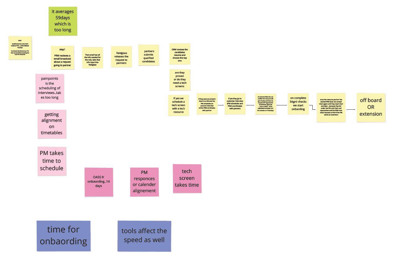
Several User interview session were carried out with partners from different categories. Through interviews and observing their interactions, we aimed to understand their challenges with the current system. Our goal was to deeply understand the user experience within partner portal's .


User Walkthroughs
This session allowed obeservation of the users as they used the system while speaking aloud. This helped in identifying usability issues that the users did not even know they had as questions were asked when unexpected actions were taken.
Interpretation of findings
After collecting data through immersion, which includes interviews and observations, the next step is to interpret what this data reveals. This is where we begin to make sense of the pain points and challenges that users are facing.
Findings:
Course Discovery Issues: Users struggle to find specific courses and content.
Navigation Frustration: The navigation system is causing user frustration.
Lack of Onboarding: No guidance available for new users.
Inconspicuous Call-to-Action Buttons: Essential buttons are not easily visible or accessible.
Resolve duplicate apple directory accounts
Fix the support link in the app
Need for personalization
Feature Requests:
Customizable Quick Links: Users want the ability to choose and personalize quick links on their dashboard.
In-Account Communication: A feature for user communication within the partner account to prevent duplicate activities.
Insufficient Metrics: Users request more metrics and statistics to track what has been accomplished.
Flexibility in Reporting Issues: Need for a more flexible system to report and address issues.
Introduce a floating chatbot that will follow the user where they go, so they easily find help
Create a resources page for user guides, videos etc
Competitive analysis
Competitive analysis was used as a source of inspiration for the proposed solution. It provides insights into how other platforms or tools handle bookmarking, snippet collection, and support management, which helped in understanding best practices and user expectations.

The competitive analysis reveals that integrating a Save to Pocket-like feature can notably enhance our application's bookmarking and snippet collection capabilities. This addition would offer a superior solution for saving, organizing, and accessing content compared to standard browser bookmarks and tools like Zoho and WordPress. It's also noted that Zoho's chatbot feature is a standout aspect.
Identify themes
Define insights
User stories
Empathy map
Journey map
Pain points
Problem statement
In the Define stage, the project team identifies and prioritizes key user pain points, establish clear problem statements, and begin shaping actionable insights to guide the solution design.
Identify recurring themes
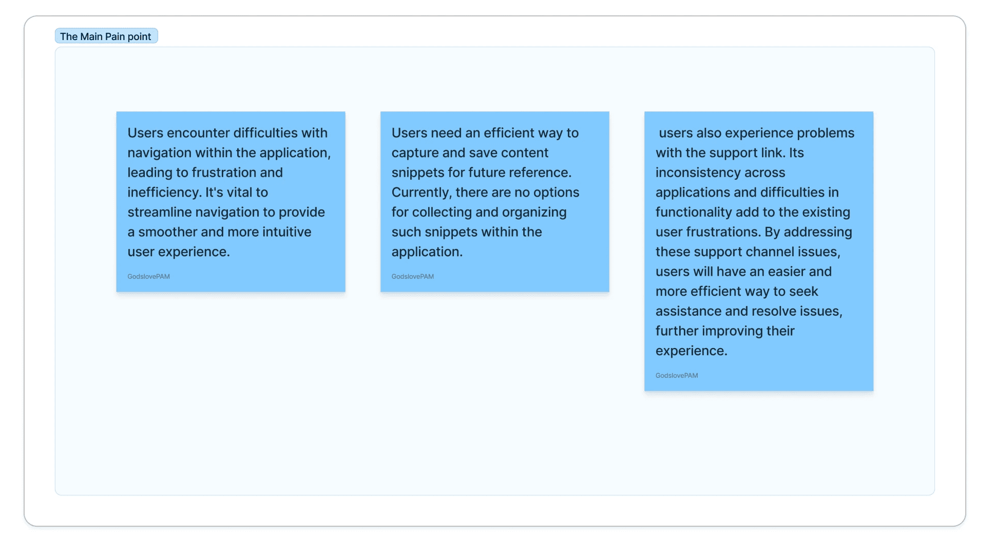
As a way to analyzing the findings, we can identify recurring patterns. In this instance, we can see that navigation content snippet collection and support are key themes that require attention in the project. These themes will serve as a guiding force throughout the design process

Define How might we insights
At this point, we defined key insights based on the data we collected and the themes we identified. In this project, insights would revolve around the
How might we streamline navigation?
How might we create an efficient content snippet collection?
How might we personalize the experience?
How might we create an ever present access to support?
These insights serve as the foundation for developing solutions in the subsequent stages of the design process.

User stories
As a user, I want a quicker and more intuitive way to navigate within the application so that I can perform tasks without stress
As a user, I want to collect and organize content snippets for easy reference.
As a user, I want to be able to bookmark content so that I can easily find them.
Empathy map

Initial user journey
We created user journey maps to visualize the typical user experiences, highlighting the moments where users face difficulties or frustration.


Painpoints

Problem statement
At this point, after analyzing all the data we got, we can now make an informed decision, why do we need this project?
Identify themes
Define insights
User stories
Empathy map
Journey map
Pain points
Problem statement
This stage aims to provide solutions that address user pain points and also deliver an intuitive, user-friendly experience based on user feedback and testing.
In the course of doing this we need to do a competitive analysis to get valuable insights for decision-making, differentiation, and sustainable growth in a competitive marketplace. It helps will also help us make make informed choices and adapt our strategies to gain a competitive edge.
Proposed solutions (what is our solution)
1. Deep Linking: Implementing deep links within the app to enable quick navigation to different pages, enhancing the user experience by providing easy access to various sections of the application.
2. Snippet Collection: Allowing users to capture and store content snippets from the app, complete with thumbnail images for convenient reference and organization.
3. Support Bot Integration: Introducing a floating support bot icon that users can click on to access support or ask questions. The bot is intended to be available in multiple applications.
User journey after the proposed solution
After proposing a solution, we utilized user journey map to illustrate the anticipated user experiences, emphasizing the points where difficulties or frustrations could arise.

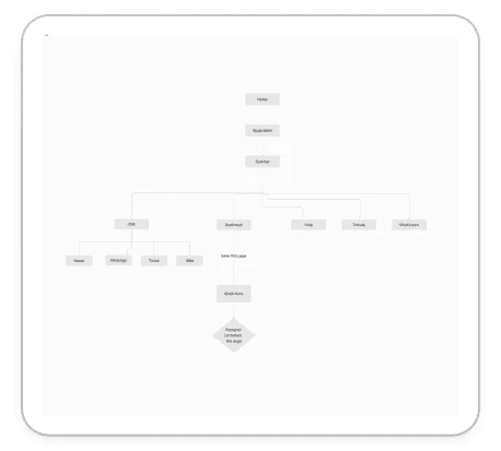
Userflow
Design
At the beginning of the design phase, a variety of conceptual designs emerge. These are born from thorough research, detailed user personas, and a clear focus on the product's goals. Wireframes, prototypes, and mock-ups are crafted to give physical form to these ideas, each iteration refining the initial concept.
The evaluation and refinement of these designs are critical. Usability tests are conducted, inviting users to engage with the prototypes. Their interactions, feedback, and behaviors are meticulously observed. This phase is vital as it unveils how users navigate the product, pinpoints any difficulties they face, and determines if the design meets their needs and goals.
This design process is characterized by an iterative and user-centered approach. Feedback and observations from users are instrumental in each subsequent iteration, ensuring the design evolves to meet user requirements more effectively. This cycle of testing, receiving feedback, and making redesigns guarantees that the final product is a result of continuous improvement and adaptation. The end result is a design that effectively balances functionality, user engagement, and an exceptional user experience.
Bot Integration

Deeplinks
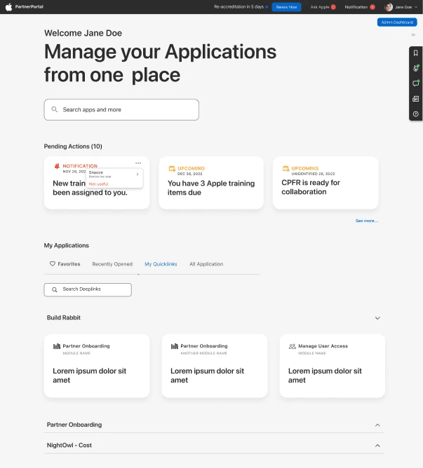
Dev Handoff: Requirement documents and user stories were meticulously crafted to mirror the solutions outlined in the design. Additionally, high-fidelity designs were transitioned to the development team. A critical aspect of this phase was the inclusion of developers in the internal reviews of all design iterations. Their involvement from the start ensured they were fully informed and integrated into the process, significantly reducing the likelihood of pushback in later stages.
Design QA: A proposal was submitted to the Project Manager highlighting the advantages of conducting a Design Quality Assurance (QA) check after development and before moving to User Acceptance Testing (UAT). The purpose of this Design QA is to ensure that the final product not only meets technical specifications but also delivers the intended user experience as designed. This step acts as a critical bridge between development completion and UAT, safeguarding the quality and fidelity of the design in the final product.
Scaling up: Scaling up in this project might involve expanding its functionality to cater to a broader user base, potentially including new partner types, additional features, or even considering international expansion.
Remind People What Changed:: It's crucial to remind users and stakeholders about the changes and improvements made to the Partner Portal. Communication, such as newsletters, email updates, or in-app notifications, should be used to ensure users are aware of the enhancements and how they benefit from them.
Build Network:: Building a network involves forming partnerships or collaborations with other organizations or entities that can contribute to the success of the Partner Portal. This may include integrating with third-party services or partnering with complementary businesses to provide added value to users.
Conclusion
In conclusion, addressing the identified pain points and leveraging these innovative solutions for deep linking snippet collection and floating chatbot will not just enhance the user experience but also align with user desires for convenience and efficiency, making our applications more user-friendly. By implementing these changes, we can not only meet the users' expectations but also stay competitive in the market